Sign inGet started

Changelog

March 2, 2023

Redshift schema browser, SSH & SSL connections & integration updates

🔍 Redshift schema browser

Now you can find the Amazon Redshift data you need from the comfort of your notebook.

Next time you want to explore your Redshift schema tree, simply click on the connected Redshift integration in the right sidebar.

redshift-schema-browser.gif

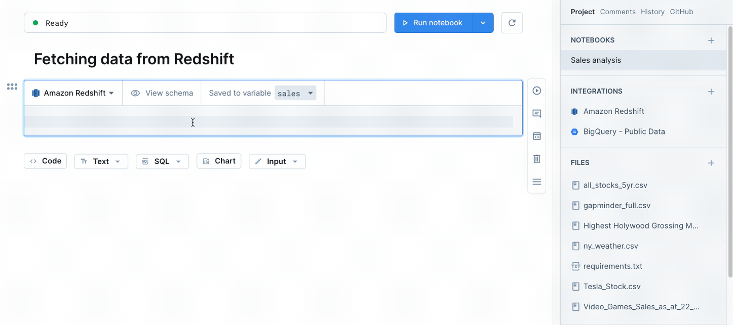
You can also access the schema right from an SQL block by clicking on the View schema button. Discovering your data’s never been easier.

And stay tuned for a brand new schema browsing experience for Redshift and other data sources coming to a product update near you!

Read more on our Amazon Redshift integration here →

🔒 SSH & SSL database connections

You now have more options for securely connecting to databases on private networks.

ssh-ssl-connections.png

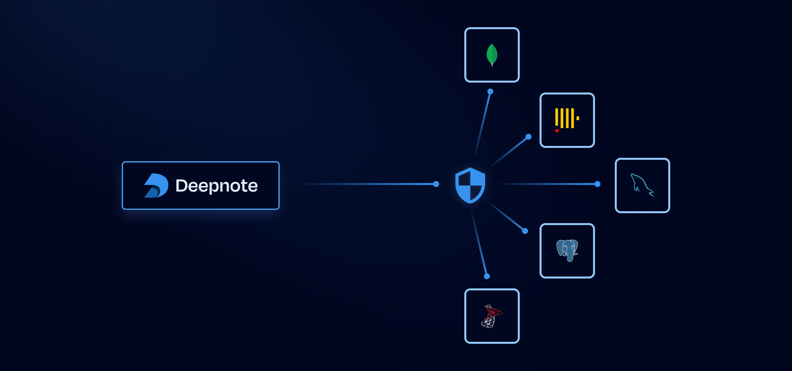
In the past you had the option of authorizing Deepnote’s IP addresses. Now you also have the option of specifying an SSH connection in the Integrations menu. We’ll automatically generate a public SSH key that can be added to your SSH bastion.

Meanwhile, if the database supports it, any queries executed from an SQL block will automatically connect to your database via an SSH tunnel.

We’ve also added new options for enforcing SSL encryption and verifying server certificates to help you keep your data secure.

Read more on securing connections here →

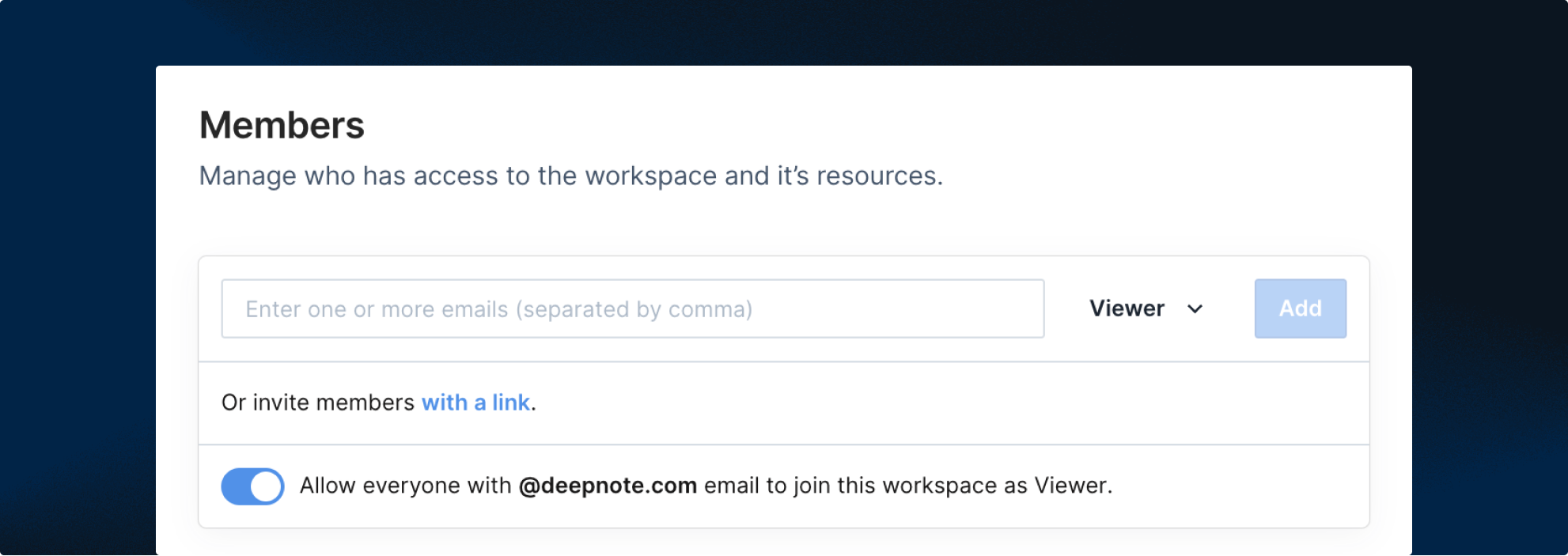
🔌 Integrations added to the right sidebar

Reviewing and updating workspace integrations just got easier.

Instead of living in a separate tab, project integrations are now displayed in the main project tab of your notebook.

integrations.gif

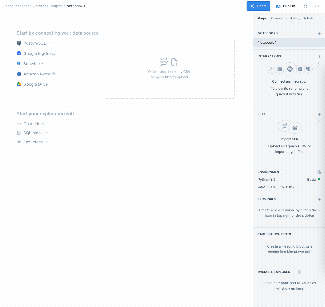
No more clicking away to find out which integrations are connected or need to be added.

Read more on integrations here →

Updated SSO, upgraded audit logs, new billing controls & much more

enterprise-release.png
🔒 SSO updates & directory sync

It’s easier than ever to control which team members or groups can log into Deepnote using the identity provider of your choice.

If you’re on the Enterprise plan, you can now use single sign-on via SAML or OIDC connection, including Google, Okta, Azure AD, OneLogin, and more.

SSO.png

You can also sync users from your directory provider — such as Okta or Active Directory — into Deepnote via SCIM. This makes it a breeze for companies with larger teams to manage users.

Read more on SSO & directory sync here →

🔍 Audit log metadata & exports

Get more out of your data warehouse audit logs with Deepnote. Queries from Deepnote’s SQL blocks now include helpful metadata, such as who ran a query and in which project, so you can keep tabs on those overly expensive queries.

audit-log-export.png

And if you’re an admin on the Enterprise plan, we’ve made it even easier to investigate activity for security incidents. Admins can now export an audit log as a CSV from the General settings menu.

Read more on audit logs here →

💰 Billing alerts & limits

Stay on top of your machine costs without breaking a sweat.

You can now send billing alerts to all admins for a workspace. Simply set up a monthly dollar limit for pay-as-you-go machines in the Billing & usage menu and all admins will be notified via email when it’s reached.

pay-as-you-go.png

Looking for other ways to keep costs predictable? Admins can now also disable pay-as-you-go machines for a workspace, shutting off this option for users (this will move any running projects to a Basic machine at the next start).

Read more on billing alerts & limits here →

🎨 New color scales for charts

Dress up your charts in truly eye-catching colors!

When you’re selecting colors for a quantitative or temporal column in charts, you now have a much wider range of choices, including single-hue, multi-hue, and divergent color scale options.

chart-color-scales.gif
🔢 Customize axis number format in charts

Want to change the displayed number format of your chart’s quantitative axis? Now you can just point and click — no code necessary.

axis-number-format.gif

Simply go to the Format tab and choose your preferred option from the Number dropdown menu. If you want to get even more granular, you can also customize the number of decimals you wish to show.

Chart recommendations, flexible chart filtering & Microsoft sign-in (plus SSO support)

🤖 Smart chart recommendations

Get ready to accelerate your data visualizations with chart recommendations.

Next time you create a chart block, you’ll have the option to click on the Explore button, which will bring up a gallery of recommended charts based on your DataFrame.

explore.gif

The gallery includes the most commonly used chart types for data summarization. Simply select an option to use it as your own (Replace chart) or create a new chart based on it (Add new chart).

No more starting from scratch each time you need to build a chart. Quickly browse a wide range of data summaries, pick your starting point, and customize from there.

🖱 Interval selection on charts

Chart filtering just got a lot more flexible.

You can now select a range of data points directly with your mouse when you want to apply a filter to your chart.

interval-selection.gif

Click and drag over an area on the chart to highlight your data. Then hit the Filter button to include or exclude the selected data or inspect it in a new DataFrame.

Zooming in on outlier data points is now easier — and more precise — than ever.

Read more on interactive filtering here →

🔐 Microsoft sign-in & enforcing SSO

You can now sign up and log in to Deepnote using your Microsoft 365 account.

And if you’re an admin on the Enterprise plan, you can enforce specific single sign-on methods — including Microsoft, Google, Okta, and more — for all members of a workspace.

sso-enforce.png

Authenticate users and keep workspaces secure with ease.

Read more on SSO here →

Chart updates: export to DataFrame & value labels

📊 Export chart to DataFrame

Want to explore the data behind a specific part of your chart? Now you can create a new DataFrame from filtered data when you apply a filter on a chart block.

chart-dataframe-export.gif

Close the analytical loop without having to manually write any code — simply click the DF button and a new code block will be added below your chart.

🔢 Value labels on charts

It’s easier than ever to improve the readability of your charts (always handy when you’re sharing your results with others). When you create a bar, line, or area chart, you now have the option to turn on Value labels in the Format tab.

value-labels.gif

Just use the toggle to display the numerical values of individual data points. And voilà — your charts are that much easier to read.

More chart color options, flexible dates for charts & CSVs in notebooks

🌈 More color options for charts

Add more color (and context) to your charts with a wider range of color palettes. When you select a categorical column in the Color option, you can now choose between multiple color palettes.

color-options.gif

If you want to apply a single color to the whole chart, simply select it (or add a custom color of your own).

custom-color.gif
🗓 Flexible date units for charts

It just got much easier to adjust the granularity of time series analysis on the fly. When you add a temporal column to an axis, you can now change the displayed time unit.

flexible-date-units.gif

Pick from multiple time intervals/formats in the dropdown menu and the temporal axis will be grouped by the selected unit. No more having to reshape your dataset with code!

🗂️ Drop a CSV into a notebook
drop-csv.gif

Easier workflow alert! You can now drag and drop a CSV into a notebook(either from your computer or from your project files in the right sidebar) and query away.

Add-ons to charts: exporting into code & adding secondary measures

🐍 Export charts into code

If you need even more flexibility to customize your charts, you can now duplicate your chart block into code by selecting the option in the block actions menu.

export-charts-to-code.gif

This adds a new Python code block to your notebook, containing the configuration of your chart in the Vega-litespecification format. Vega-lite is very powerful and fairly easy to learn, so it’s a great option if you need to create a finely customized or super-advanced visualization.

📐 Secondary measures on charts

You can now add secondary measures to charts with one click.

When you create a chart with a categorical and measure (quantitative) column on the X and Y axes, we now display a plus (+) button next to the selected measure. Click on it, pick your secondary measure, and we'll create a new chart layer with all settings pre-configured for you, including the legends. It’s as easy as it sounds!

secondary-measures-to-charts.gif

If your secondary measure happens to be on a different scale, you can also switch to dual axis mode under the Display tab. This will visualize the two measure axes independently.

dual-axis-mode.png
👋 Share private projects by name
private-projects-sharing.png

To simplify sharing private projects with other workspace members, we’ve updated our project-sharing options to accept names in addition to emails.

More on project sharing options in our docs →

Data visualization for everyone: Introducing the new chart block

data-visualization-for-everyone-deepnote-chart-blocks.png

We've overhauled chart blocks in Deepnote to bring you a more intuitive and flexible no-code data visualization experience. Chart blocks are rolled out to everyone using Deepnote as of November 16, 2022!

Here are some highlights of what’s new:

  • More chart types, including compound charts with multiple layers
  • Essential formatting options to customize your chart axis and canvas with a few clicks
  • Simplified workflow for building your exploratory graphs even faster
  • Many quality-of-life improvements, including chart resizing and an option to hide the configuration details

And don't forget to check out these additional resources:

  • You can learn more about new chart block capabilities in our docs →
  • For practical examples of how to use the chart block for data exploration without writing a single line of code, check out our showcase notebook →
  • If you’d like to take a peek into our product kitchen, we also wrote a blog post about our thought process and design approach for this major upgrade — read it here →

Bulk domain invites, favorites & new integrations with Snowflake & Keboola

✅ Invite anyone with your email domain as a viewer

We’ve introduced an easier way to share notebooks with anyone at your company: domain invites.

Admins can turn this setting on to enable anyone with a matching email domain (e.g., @yourcompany.com) to join your workspace as a Viewer. And because Viewer seats don’t count toward plan limits, you can add as many team members as you’d like for free.

email-viewers.png
💙 Favorite projects for fast access

We’ve added the option to favorite Deepnote projects for faster access. When viewing a notebook or project, simply click the star ⭐ icon (located in the top right navigation bar) and we’ll pin it to a favorites section in your workspace.

favorite-projects.png
❄️ Exploratory data analysis with Snowflake & Deepnote
snowflake-guide.png

We shipped a Snowflake quick-start guide for building an accelerated exploratory data analysis (EDA) workflow with Snowflake and Deepnote. Specifically, the guide covers methods for effectively cleaning and visualizing weather readings, which can be applied more generally to any dataset used within Deepnote.

Check it out →

🐙 Trigger notebooks to run with Keboola & the Deepnote API
keboola-deepnote-api.jpeg

Our friends at Keboola released a new component that enables you to trigger the run of a specified notebook in Deepnote using the Deepnote API.

Read the docs →

dbt Semantic Layer

🔌 dbt Semantic Layer is now an official Deepnote integration!
dbt-semantic-layer-deepnote-cover.png

With the dbt Semantic Layer and Deepnote, you can import metrics defined in dbt directly into your Deepnote notebook and give your data team a consistent, reliable way of defining and consuming metrics.

Combining Deepnote and dbt unlocks use cases that include: speeding up ad-hoc reporting, mixing historical and predictive analytics, dashboard prototyping, and much more.

Here are some resources for using dbt and Deepnote:

Sorry, your browser doesn't support embedded videos.

← Previous pageNext page

Footer

Product

  • Integrations
  • Pricing
  • Documentation
  • Changelog
  • Security

Company

Comparisons

Resources

  • Privacy
  • Terms

© Deepnote